Opinion: Hey Spotify, maybe you should consider a new graphic designer
How Spotify was a graphic design disaster as well as inventive and trendy
December 23, 2021
Spotify is the most popular audio (music and podcast) streaming service with around 381 million users from all over the world, as well as 172 million subscribers who are signed to Spotify Premium, a subscription that allows users to listen to music anytime and anywhere with unlimited skips and zero advertisements. According to Statista, Spotify earned an average revenue of over 7.88 billion euros, which is an average of 7.66 billion U.S. dollars in the year of 2020. Due to its growing popularity, one can assume that their revenue has increased.
As the year began to wrap up, users of Spotify eagerly awaited their annual Spotify Wrapped; a marketing campaign that began in December 2016 that allows users to see their activity from the app and share it on all platforms of social media if they so wish to do so. With this, graphic design plays a huge part in the representation of a person’s data activity.
On average, the typical Spotify graphic designer can make upwards of 140,000 dollars yearly, according to Indeed; so what’s up with some of the design elements on this year’s Spotify Wrapped if the graphic designers are making a fair amount of money?
Lincoln Southeast High School (LSE) photography and drawing teacher Amber Buhrman believes that the quality of design depends on the eye that is viewing it, but there is a difference between what is well or poorly executed.
“I think there are principles that guide good design. At the same time, there is a certain amount of taste involved. [A person] may be attracted to a different style of visual graphics than maybe I would be, or maybe our styles would align,” Buhrman said. “I think it’s not necessarily an either-or type situation, it’s more of an and.”
As a person with some design experience, I tend to prefer a more minimalist approach with some fun, bold elements thrown in here and there. I believe that less is more when it comes to design, meaning that a few things can express what needs to be said. Spotify did have a bit of a more simple approach since a user’s screen wasn’t flooded with information and graphics most of the time, but there are elements that need to be changed from here on out.
The breakdown and overall grades:
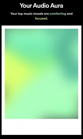
A – A new feature that was added to this year’s Spotify Wrapped was a user’s audio aura; a combination of colors describing what a user’s visual moods were for the year based on what artists and songs they were listening to. As of right now, the gradient of colors is trending in the world of graphic design, so for the designers of Spotify to include this trend was an excellent choice as it makes it more appealing and timely. For a better understanding of what gradients are in terms of design, gradients are color transitions that are a gradual blending from one color to another. The execution of this new feature was spot on and definitely worth sharing with others. The colors were not too saturated or dark and had a perfect harmony of warm and cool colors.
B – I enjoyed the interactive elements Spotify added. An example that stood out to me was their inclusion of “two truths and a lie,” where a user is given three different statements regarding their Spotify data and were to pick which of those was a lie. Elements like these make Spotify Wrapped more engaging and fun to look through. The one issue I had with this, though, was that some of the phrases they used to make it more timely, trendy, and engaging were a bit cringey. Phrases like, “you understood the assignment,” “you deserve a playlist as long as your skincare routine,” and “your music gets a vibe check” have been overused and are now somewhat repetitive or even outdated. They could’ve used simple phrases instead of trying too hard to fit into pop culture.
Buhrman also pointed out an issue with the overall typography and organization.
“In my humble opinion, some of the text was really small and hard to read. I see that as a negative, especially when there’s a lot of text on some of the slides. [The slides] are timed, so when you’re under a lot of pressure to read the text before it moves on, it makes me anxious,” Buhrman said. “I don’t necessarily love it when they do that.”
C – When it comes to wanting to grab a user’s attention, one may think that bright neon colors are the way to go. Even though it works in some cases, a few of the color combinations were too distracting, making the design look too loud and busy. Using bright colors on top of another bright color, it causes over-stimulation in the retinas which can then strain the eyes.
D – The idea of creating bands to serve as transitions into new slides are a nice way to compel users into their music data, but the performance was substandard. The designers tried to add graphics and characters (number and letters) inside the bands to make it less plain, but when it got to the pivots of the bands, it looked sloppy and practically glitched.
Buhrman also agreed that the bands could use some work.
“The banding that seems like wrapping paper or ribbon or something along those lines seemed a little rudimentary. [It] wasn’t very good looking with how they filled the shapes, and it was not smooth around the edges,” Buhrman said. “It’s a little surprising, especially when you would expect an online platform to produce something more refined and detailed for some simple graphics.”
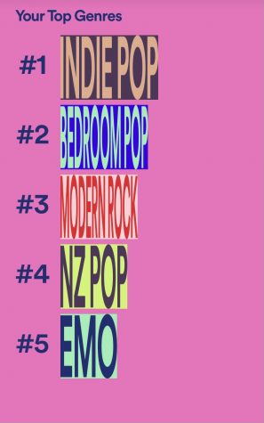
F or even a Z – A feature that has always been a part of Spotify Wrapped is a user’s top genres of the year. In the past, Spotify had done different things with the top genres such as making 3-Dimensional bar graphs or just simple single-colored bars, but this year they tried some experimenting. In all honesty, the execution was very poor to say the least. From first glance, some of the colors clash and are a bit too bright to look at; the neon colors should have been opted out for something a bit more muted but bold at the same time. Although the colors were a slight problem, the text inside the bars is really where the disaster begins. A user’s top five genres are displayed on the screen shortly after the other, with the size adjusting to fit the number they are at on the scale. This is where the core of the issue is at: some users may listen to a genre that has a lengthier name (i.e. underground hip-hop), and there is absolutely no way that could cleanly fit inside the tiny bar. By the looks of it, some of the genres look like bar codes due to how crowded the letters are. If Spotify could change one template immediately for next year’s Wrapped, I would recommend the top genres in a heartbeat.
Although there were some things that I disliked and felt as if there should’ve been more effort put into the design, there are some factors that should be taken into consideration before judging the work of the designers.
“There’s a possibility that [Spotify Wrapped] was either rushed or like every company, most companies are experiencing a shortage in the labor force. Maybe it was rushed, or maybe there were just fewer employees that were able to work on it,” Buhrman said.
Even with some challenges, design is an important factor to not only Spotify but many other online platforms. Design is another form of communication and expression. When design is created well, it is memorable and impactful to not only an audience’s eyes, but also how they take it in. Bad design is forgettable and unable to hold a great amount of value, making it more difficult for someone to come back to. Despite a few disastrous elements, Spotify deserves credit for experimenting and producing an interactive, fun way to view audio data.